Humans are lazy. We don’t like to wait, and we don’t like to repeat the same actions over and over. Last week I was taking an Uber home and wanted to get a fare estimate, and their UX pissed me off. I had to keep toggling back and forth to compare fares between the various levels of service.
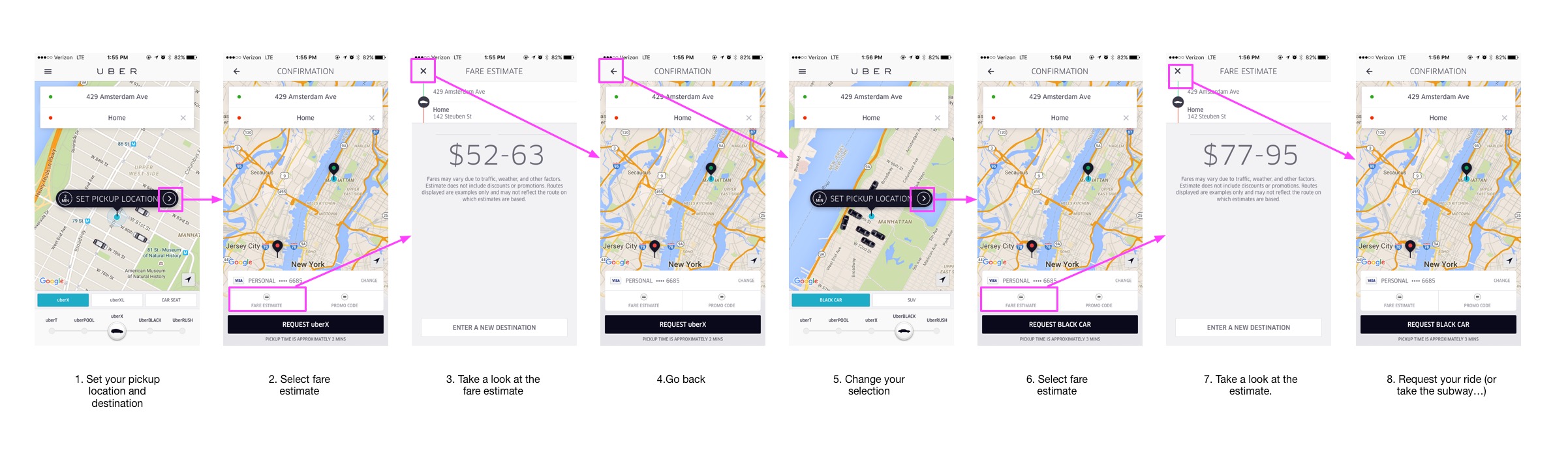
This was way too many steps, and it pissed me off. I ended up taking the subway (ok, so maybe I cheaped out after seeing the fare…). Regardless, comparing all these fares was incredibly painful and took way too long. A simple UX upgrade on the fare estimate screen would drastically improve the experience, and make it easier for me to request a ride.
As a user, this is the experience I want:
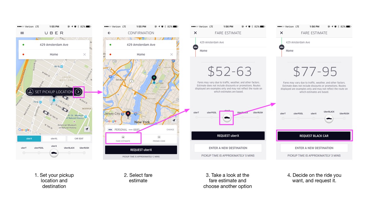
This upgrade reduces the number of steps it takes to compare fares. It upgrades the user experience by making this task simpler. All the comparison can take place without leaving this screen.
When designing a product, always account for the lazy user.